
Why the same colour looks different on different fabrics
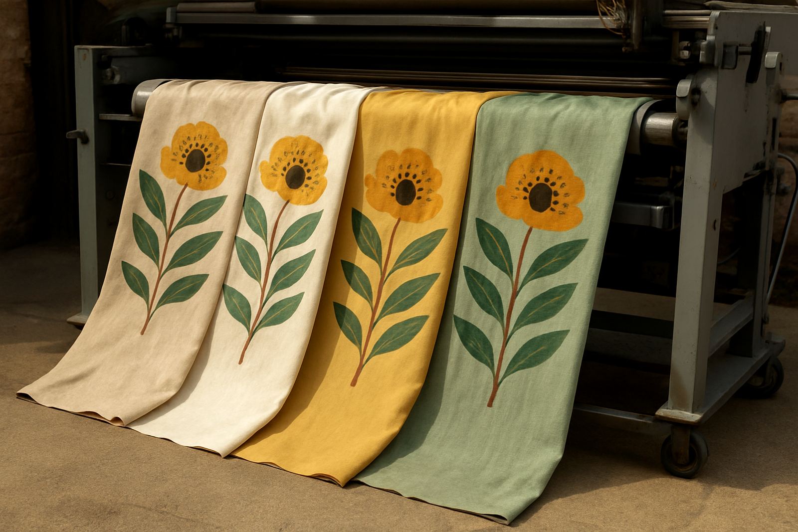
A red that looks bold on a smooth polyester may come out softer on a textured cotton blend. That is not a fault in the file or the print run, it is how fabric behaves. Some fibres hold ink near the surface, while others let the colour sink in and lose a bit of punch.
At our Cape Town base in Ndabeni, this is one of the first things we explain before we print curtains, upholstery, flags or fabric by the metre. A client in Woodstock may want a deep navy for scatter cushions, while a shop in Century City needs the same navy to read clearly under bright shop lighting. The same artwork can be right for one use and wrong for another.
Here are the main reasons colour shifts happen:
- Fabric base: smooth, coated and tightly woven fabrics usually show sharper colour than loose weaves.
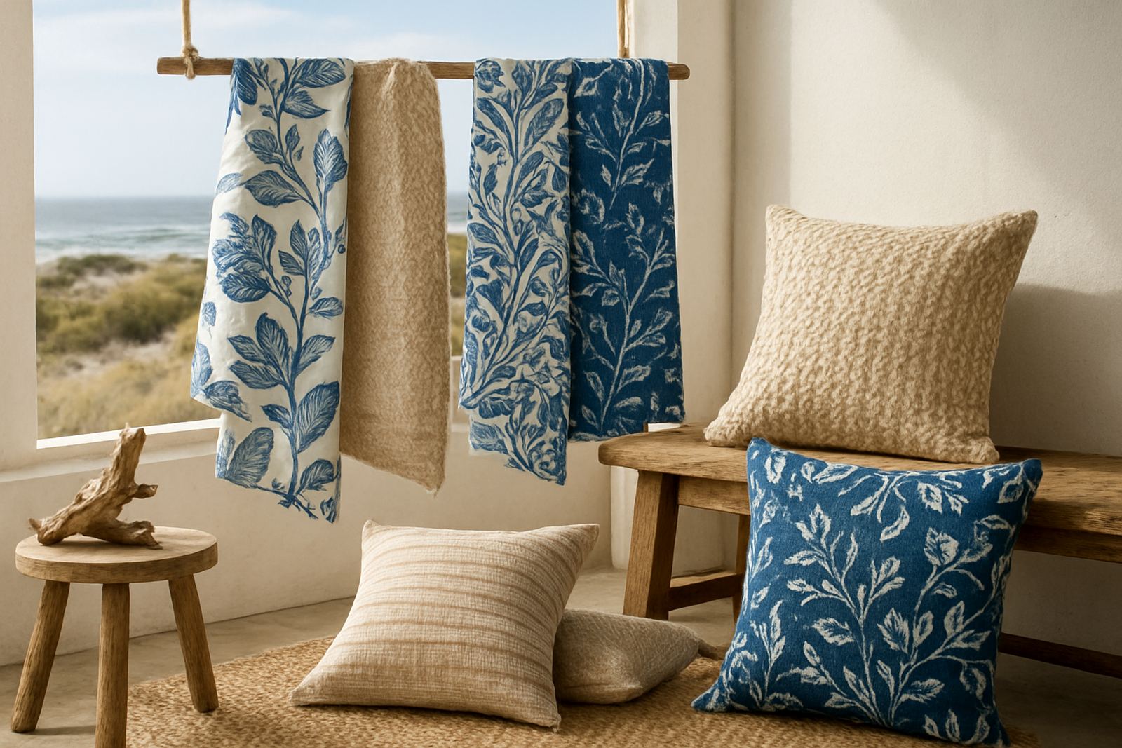
- Fibre type: natural fibres and synthetic fibres take print differently, so the same pigment can appear warmer or cooler.
- Weight: heavier fabrics can mute lighter shades, especially on upholstery and lined curtain work.
- Surface texture: texture breaks up the image and can soften fine detail.
Light in Cape Town changes the way print colour reads
Colour does not stop at the fabric. Where you hang it or use it changes everything. Coastal daylight in Cape Town is bright and clean, while a room with north facing windows can throw a strong glare across pale prints. In the afternoon a curtain may look cream, but by evening under warm LEDs it can read more yellow.
This matters for clients from Salt River to Montague Gardens who use printed fabric in retail spaces, event setups and home interiors. A brand flag viewed outside in full sun needs a stronger contrast than a table drape seen under indoor lighting. If you are choosing fabric for a room with load-shedding backup lights, check how the print looks under that lower light too.
Small changes in light can shift the feel of colour in these ways:
- Natural daylight can make blues feel clearer and whites feel brighter.
- Warm indoor bulbs can push neutrals towards cream or beige.
- Direct sun can flatten detail and reduce the look of contrast.
- Shaded areas can make dark colours seem heavier than they are.
Finish and coating can lift or dull the final result
The same artwork on two finishes can give two different results. A matte fabric usually gives a softer look, while a smoother finish can make colour appear crisper. If the surface has a coating for outdoor use or added durability, the print may sit differently again. That is why we test before a bulk run when the colour has to match a sample closely.
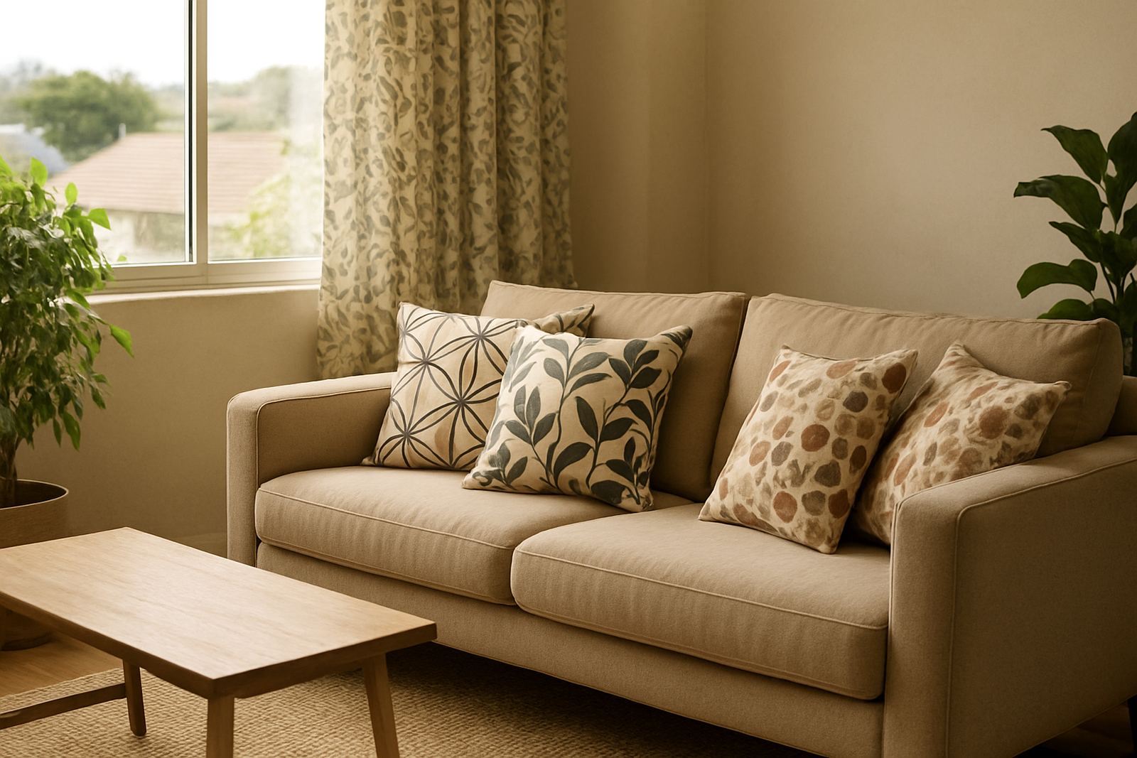
For upholstery in Durbanville homes or office use in Observatory, finish matters because the fabric has to hold up to handling as well as look right. A high-contact chair fabric should not only be durable, it should keep the print readable after regular use. On curtains the issue is different. The print must look good in folds and when it catches light at an angle.
- Matte finishes: softer appearance, less glare, good for interiors.
- Smoother finishes: sharper edge definition and stronger visual contrast.
- Outdoor finishes: built for exposure, but colour may look slightly different to indoor fabric.
- Heavy fabrics: can flatten fine detail in small repeats or tiny lettering.
How to set up artwork when colour needs to stay true
Good file setup makes a real difference, especially when the final product includes repeat patterns or branded fabric for multiple uses. If a design has a pale background and thin lines, those parts can disappear on a textured cloth. If the file is too dark overall, small details may fill in during printing.
When we check files for clients across South Africa, we look at the job in context. A fashion label may need a fabric by the metre with consistent tone across the roll. A business ordering flags may need a stronger colour block so the logo still reads from a distance. A homeowner ordering custom curtains may want the design to match scatter cushions without looking harsh.
Before printing, these steps help avoid surprises:
- Send the file in the right size and resolution for the final use.
- Keep important details away from edges and seam lines.
- Ask for a strike-off if the colour must match an existing item.
- Share a photo of the room, product or fabric it needs to sit with.
Strike-off samples save money on the bigger job
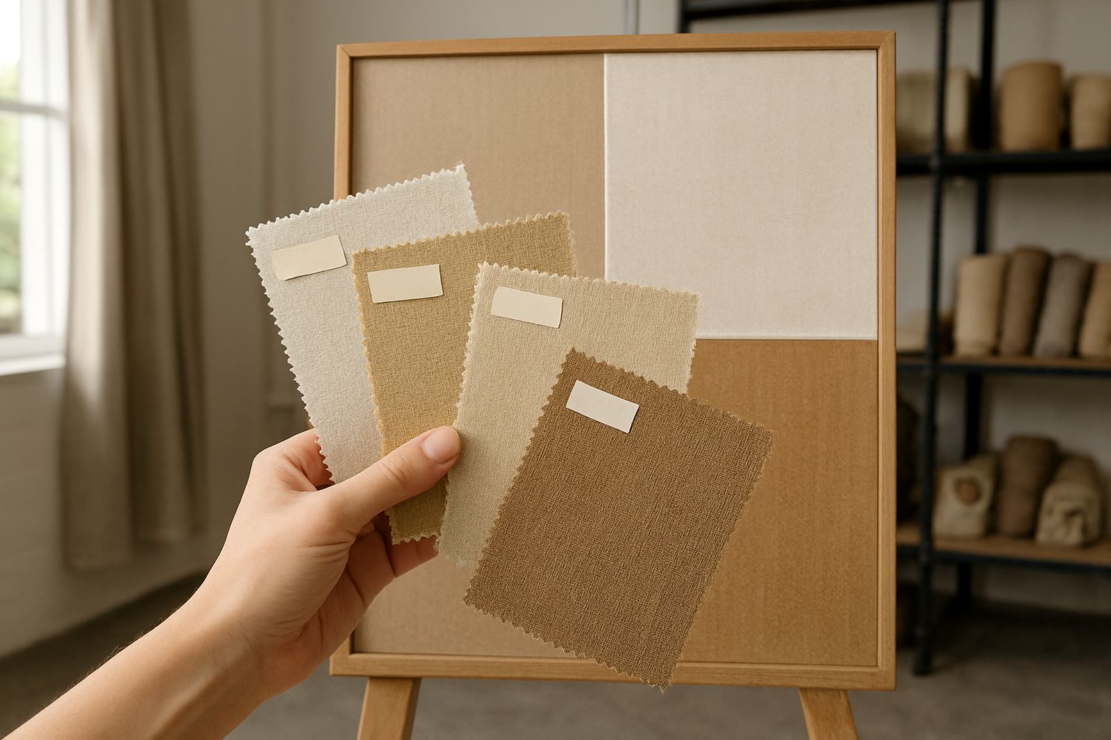
A strike-off is a small sample print that shows how the colour behaves on the chosen fabric. It is one of the easiest ways to avoid waste. If a design is meant for 20 metres of curtain fabric or a bulk print run for a retail rollout, checking first can prevent costly reprints.
This is especially useful for clients in Cape Town who need quick turnaround and cant afford delays. A sample can show whether a cream really stays cream, whether a brand blue reads too dark, or whether a fine stripe is still visible after printing. If a job needs hemming and finishing as well, the sample also helps you see how the print sits once the edges are treated.
It is worth asking for a sample when:
- the colour has to match existing decor or branding
- the fabric base is new to you
- the design includes fine detail or small text
- the order is large enough that mistakes would be expensive
Practical colour choices for curtains, upholstery and flags
Different products need different colour thinking. Curtains are seen in changing light all day. Upholstery gets close viewing and regular wear. Flags need high contrast so they can be read at a distance and in movement. A colour that works on one of these may fail on the others.
For a home in Ndabeni or a hospitality space near the city bowl, softer mid tones often work well on curtains because they stay balanced across changing light. Upholstery usually needs a firmer colour plan because the fabric gets touched and sat on. Flags and outdoor display fabric need stronger contrast, since wind, sun and distance all affect visibility.
Try this simple rule:
- Curtains: choose colours that still look good in morning light and evening light.
- Upholstery: avoid very pale shades if the fabric will see heavy daily use.
- Flags: use clear blocks of colour and strong contrast for better legibility.
- Fashion fabric: test how the colour moves and folds before committing to bulk.
What local experience tells us about colour matching
In Cape Town, colour decisions often need to suit both the weather and the building. Coastal humidity can affect how fabric feels and hangs, while strong sun can expose weak contrast. Inside older buildings in Woodstock or Salt River, warm walls and mixed lighting can change how a printed textile reads once it is installed.
That is why fabric sourcing, file checking and sampling all matter as part of the same job. It is also why a clear conversation at the start saves time later. If you know the fabric will be used on a curtained showroom window, a busy office chair or an outdoor event flag, we can guide the print approach before the first metre is run.
The aim is not just to print colour. It is to get colour that still looks right once it is cut, hemmed, hung, folded or used day after day.