
Why a small sample beats a costly reprint
When you are ordering printed fabric, the swatch is your first proper check point. A design can look perfect on screen yet print differently on cotton, polycotton, canvas or a sheer curtain base. Colours shift, line weights soften, and some fabrics take ink in a way that changes the final mood of the pattern. That is why clients in Ndabeni, Woodstock and Salt River often ask for a swatch before signing off a larger run.
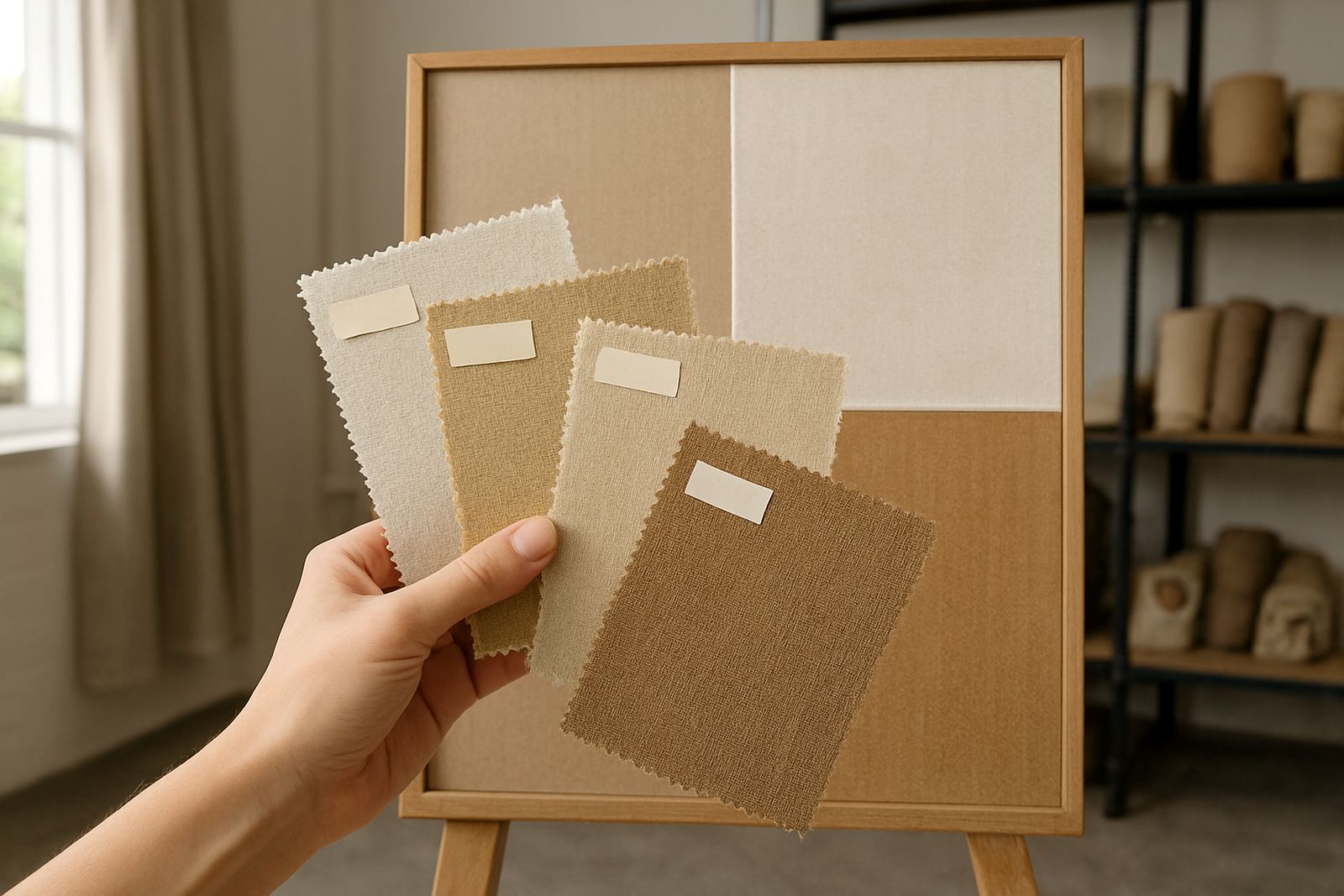
A swatch gives you something practical to hold, fold and pin up. You can see if a background is too dark for a lounge, if a repeat feels busy for a bedroom, or if a bold logo still reads clearly on a flag panel. It also helps with cost control. A small sample is far cheaper than a full batch that needs reprinting because the colour was too warm or the scale was off by a few centimetres. One small check now can save days later, especially when load-shedding, courier deadlines and fabric lead times all line up at once.
For businesses, the swatch is also a useful approval tool. If you are ordering uniforms, promotional textiles or retail ranges, it is much easier to get sign-off from a client or buying team when there is a real sample on the table. In Cape Town, that practical step often keeps projects moving without back and forth messages for a week.
What to check on a swatch before you approve the run
There are a few things worth checking every time, no matter how simple the job seems. A swatch should tell you how the design looks, feels and behaves in the light you will use it in. A sample that looks neat in a studio can still appear very different in a sunlit window or under office strip lights.
- Colour accuracy: compare the sample in daylight and indoors. Coastal humidity and strong Cape sun can make tones read differently from what you see on a screen.
- Scale and repeat: confirm that motifs are neither too small nor too large for the end use. Curtain drops, scatter cushions and dress lengths each need different spacing.
- Fabric hand feel: feel the weight, softness and drape. Upholstery needs body, while garments may need a lighter touch.
- Print clarity: check whether fine details, text or borders stay sharp after printing.
- Wash response: if the item will be washed, test for colourfastness and any shrinkage before you commit.
It is also worth folding the swatch and creasing it a little. That quick test can show whether the fabric will hold up in a curtain hem, a scatter cushion cover or a tote bag. If you are planning a larger order, keep the sample aside and note the date, fabric type and approved colour references on the back. That tiny admin step saves confusion later.
Curtains, upholstery and fashion all need different checks
Not every printed fabric is judged the same way. A curtain swatch should be checked for light flow, drape and how the pattern falls when the fabric hangs. A upholstery swatch has to work harder. It needs enough body for daily use and should look good after rubbing, sitting and cleaning. Fashion fabric is different again because it must move comfortably and still keep its print clean around seams, darts and cuffs.
For a home in Observatory, for example, a client might want printed curtains for a north-facing room. The swatch needs to be held against the window in the afternoon, not just viewed on a table. If the design goes too yellow in bright light, the room may feel warmer than expected. For a restaurant in Century City, upholstery swatches should be checked for practical wear and the way spills might show on lighter shades. For a clothing label in Montague Gardens, the print must still look balanced after cutting and sewing, not only as a flat rectangle.
This is where sample approval earns its place. It gives everyone a clear point of reference. Once the swatch is signed off, the rest of the order has a better chance of matching what was intended from the start.
How swatches help with colour matching and repeat pattern setup
Colour matching is one of the biggest reasons to request a swatch. Even a slight shift in blue, green or neutral grey can change the whole feeling of a design. If you are matching to an existing fabric, paint colour or brand palette, a printed swatch shows whether the match is close enough for the actual job. Screen images are useful, but they are not enough on their own.
Repeat pattern setup is another point where a sample matters. Some repeats look tidy in a file but feel cramped when printed at full size. Others may leave awkward joins or obvious breaks where the motif repeats. A swatch shows those issues early. It also allows the team to check how borders line up, whether text stays centred, and if the repeat works across the chosen fabric width.
- Use the swatch next to your existing items: cushions, trims, wall paint or packaging can all help confirm the final look.
- Check under the same lighting: daylight, warm bulbs and office lighting each reveal something different.
- Keep a signed sample: this becomes the reference for the full print run and any future reorders.
For business clients, this step is especially useful when more than one person is approving the work. A swatch makes the decision practical and less subjective, which is a help when the project has to move quickly.
Local Cape Town conditions can change the result
Cape Town conditions matter more than many people expect. Coastal air, bright sun and changes in humidity can all affect how fabric is viewed and used. A swatch helps you see the real life version of the print, not just the file on a screen. In Ndabeni, where many clients collect or courier fabric across the city and beyond, it is common to test samples first because the final order may be travelling to Durban, Gqeberha, George or a small town inland.
Power cuts are another practical issue. If a project must be installed during a load-shedding window, you want confidence that the fabric will work before the final metre is printed. That means checking the swatch for weight, colour and finish while there is still time to adjust. It is a simple habit, but it prevents a lot of stress.
There is also the question of cleaning and care. A swatch can be washed, steamed or pressed before you place the bigger order. That small test gives you a better idea of how the fabric will behave once it is in a home, shop or studio. It is better to discover a colour shift on a sample than after twenty metres have already been cut.
Making the swatch process work for small jobs and bulk orders
Swatches are useful whether you are buying one curtain set or a full bulk print run. For small batch printing, they help you avoid ordering too much fabric in the wrong base cloth. For larger commercial orders, they provide a standard for the full production run and future reprints. Either way, the sample creates a clear start point.
If you are sending artwork, include the intended use, finished size and any colour notes when requesting the sample. Say whether the fabric is for curtains, flags, upholstery or fashion, because each one has different needs. If hemming and finishing will be required, mention that too so the sample reflects the final product as closely as possible.
Many of our clients keep one approved swatch in their office, one at home and one with the production file. That simple habit makes reordering easier months later. It also helps when a buyer, decorator or brand manager wants to compare options quickly. The sample becomes a working reference, not just a piece of cloth in a drawer.
At the end of the day, a swatch is about certainty. It lets you see the print, feel the cloth and make a calmer decision before the bigger order is committed.