
A Woodstock brief with a tight release window
The client was a small creative studio in Woodstock working on a limited-run décor and textile release for local stockists and direct sales. The ask was simple on paper but exacting in practice: keep the artwork true to the artist’s original palette, print clean repeat panels, and produce enough fabric for both interior pieces and soft goods without wasting metres. They wanted a finished range that felt local, considered and practical for South African homes, not a rushed promotional drop.
We started by reviewing the artwork files, checking resolution, repeat integrity and the way the colours would behave on fabric rather than screen. The release needed to work for cushions, light curtains and wrapped décor pieces, so the print had to read well from a metre away and still hold detail close up. There was also a timing issue because the launch had to align with a weekend market in Woodstock, with courier parcels going out to buyers in Cape Town and further afield after that.
The first decision was to separate the range into manageable fabric groups instead of trying to force every design onto one cloth. That gave the client better control over price, handle and final use. It also kept the artwork looking more consistent across the full run.
Artwork checks, repeat setup and colour matching
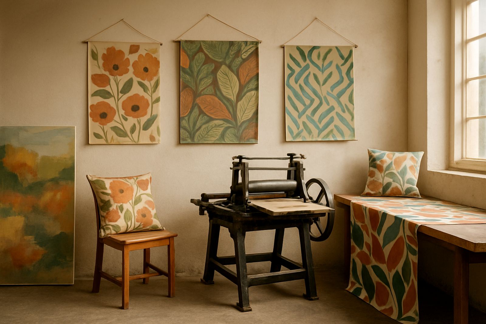
Before print we carried out file checking and repeat pattern setup on the core designs. That meant cleaning edges, confirming tile joins and making sure fine line work would not drift across the repeat. The artist’s original files included bright accent tones, darker grounding colours and some soft neutrals, so colour matching was important from the start. A small shift in one tone would have changed the whole feel of the release.
We prepared strike-off sampling so the client could review the first printed fabric before bulk production. This step is especially useful when the artwork has layered colour or a hand-drawn look, because screen colour and textile colour are never identical. The samples were checked under daylight near the studio and again under indoor light to see how the fabric would behave in a home setting. A warm grey that looked fine on screen was slightly heavy in print, so we adjusted it and re-ran the proof.
- Artwork file check for print readiness
- Repeat pattern alignment and tile review
- Colour matching against the approved palette
- Strike-off sampling before bulk printing
What we printed and how it was finished
Once the samples were approved, we moved into bulk print runs on selected fabric bases suited to the intended end use. For the décor pieces, we used a fabric that carried detail clearly and sat well in soft furnishings. For the textile side of the project, we printed a lighter option that draped better for garments and accessory items. The client wanted the range to feel premium without pushing the cost beyond what a limited release could carry.
We supplied a mix of custom fabric by the metre and smaller printed quantities for the studio’s sample and retail packs. After printing, the fabrics were hemmed and finished where needed so they could go straight into making up. Packing was done in a way that kept the cloth flat and protected, which matters with repeat prints because creasing can make the first impression look untidy. Thabo and the dispatch team also grouped the parcels by destination so the client could receive their stock in a sensible order.
- Custom fabric printing by the metre
- Bulk print runs for release stock
- Small batch printing for samples and test pieces
- Hemming and finishing for ready-to-use lengths
- Packing and courier coordination from Ndabeni
Timeline, production control and practical constraints
The full project ran over three weeks from initial artwork review to courier dispatch. Week one covered file checks, sampling and colour approval. Week two was used for production planning, material allocation and print preparation. Week three covered the main print run, finishing and packing. That timeline kept the release moving while still allowing for one round of colour correction, which was needed after the first proof came in slightly cooler than expected.
Working in Cape Town means planning around more than just the artwork. Load-shedding can slow down machinery if you are not prepared, so production windows were scheduled around power availability and our team kept the process moving with minimal interruption. Coastal humidity also has a real effect on some fabrics and on how flat they sit after printing, so we managed drying and handling carefully. The client also needed the work to meet their own make-up requirements, which meant keeping the printed lengths accurate and consistent across the full run.
Because the release was limited, waste control mattered. We kept the print quantities tight to the approved order and left a small safety margin only where the client requested it. That helped protect margins and avoided excess stock sitting in storage after launch.
How the release landed with the client
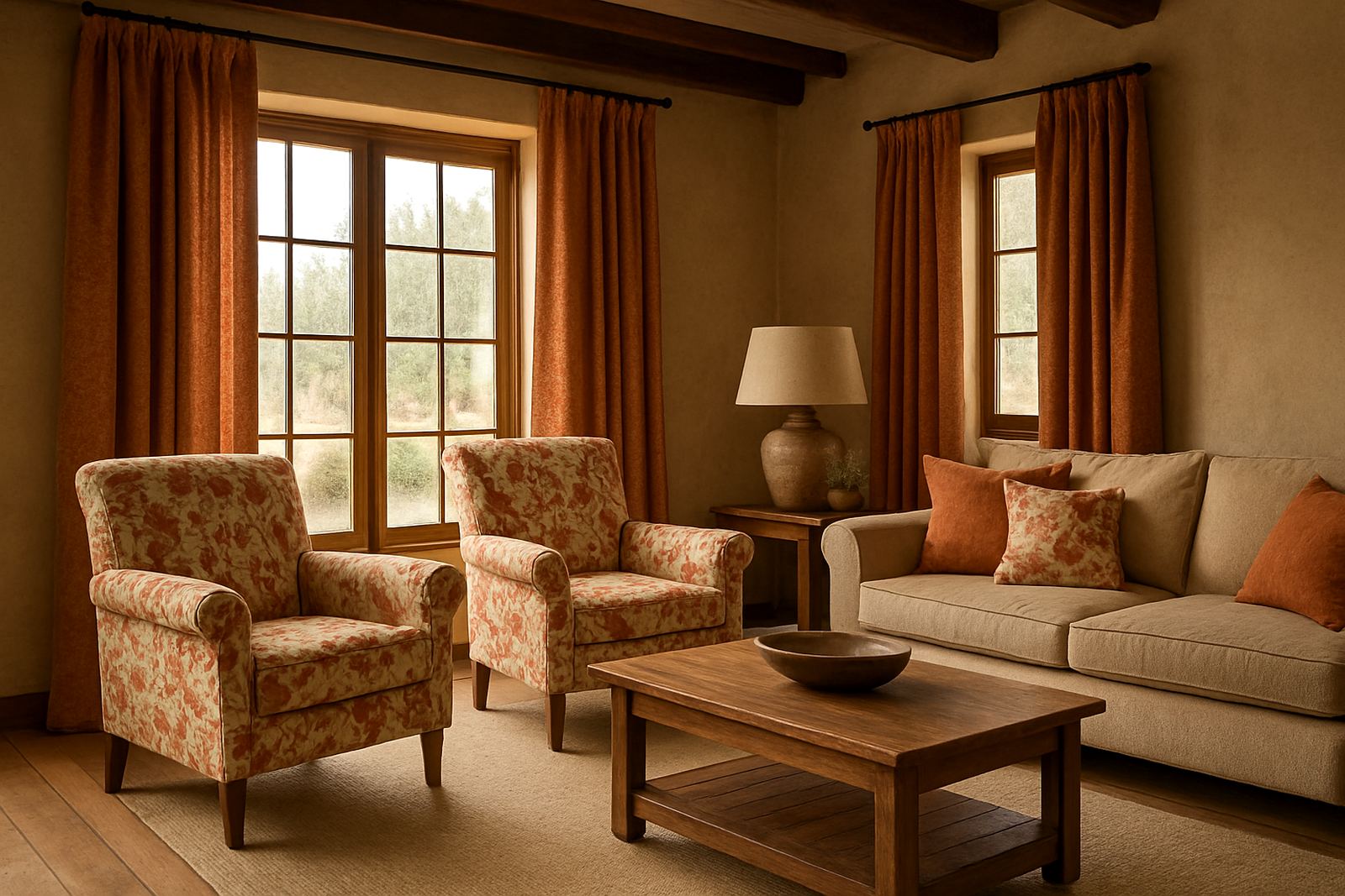
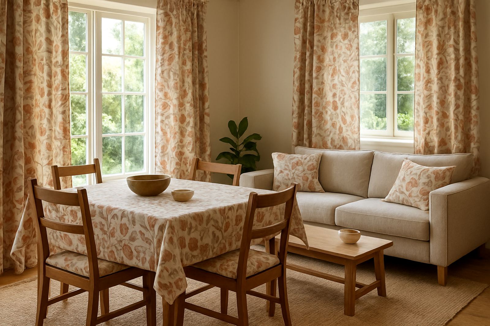
The final result was a compact fabric release with clear repeat integrity, clean colour and a strong fit for décor use. The client used the range for a curated mix of interiors and textile products, and the printed pieces carried the hand-made feel they were after without looking uneven. The limited run format also suited their market position because it gave the collection a sense of scarcity without compromising on production quality.
From our side, the most useful part of the job was the way the sampling stage reduced risk. Once the strike-off had been approved, the client could move ahead with confidence instead of guessing how the print would land on cloth. We also saw the value of separating the fabrics by final use, because that made the finishing process simpler and kept the order tidy for their own production team.
If we were doing the same project again, we would keep the same approach: start with file checking, run a strike-off, and only then move into the main print schedule. For an artist-led release, that order saves time later and gives a better result in the end.
What we would repeat for the next artist-led run
This project confirmed that a limited-run release works best when the artwork, fabric choice and timeline are planned together from the start. For future artist series work in Woodstock, Salt River or Observatory, we would recommend the same structure: sample first, confirm colour, then print in batches that match the actual launch plan. It is a practical way to keep the job controlled, especially when the release depends on a specific date or stockist handover.
For clients building a seasonal or gallery-linked textile range, the key is to keep the process small enough to manage but detailed enough to protect the artwork. That is where our team at Ndabeni comes in handy, because we can handle the file checking, print setup, finishing and courier work under one roof. For a project like this, that saves a lot of back and forth and keeps the fabric moving on schedule.
- Best for limited artist collections and décor launches
- Ideal when colour matching matters across several fabric types
- Useful for small to medium production runs with tight timing
Key facts
| Project | Woodstock Artist Series |
|---|---|
| Client type | Creative studio and décor textile range |
| Location | Woodstock, Cape Town |
| Timeline | 3 weeks from file check to dispatch |
| Services used | Custom Fabric Printing, Repeat Pattern Setup, Colour Matching, Strike-Off Sampling, Hemming and Finishing, Packing and Courier |
| Output | Limited-run printed fabric for décor and textile use |