
Start with one lead print and let it carry the room
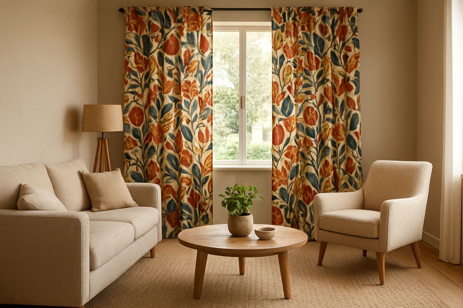
When three different fabrics compete for attention, the room starts to feel crowded. A better approach is to choose one lead print and treat the other fabrics as support. In a lounge that might be the curtains. In a bedroom it could be the headboard fabric or a pair of feature cushions. Once that lead fabric is decided, everything else should answer to it.
For homes in Cape Town, especially along the coast where bright light can flatten pale tones, a stronger lead print often works better than a weak one. Deep blues, terracotta, olive and charcoal hold their own near white walls and sunlit windows. If your room already has patterned rugs, textured blinds or a busy art wall, keep the lead fabric simpler so the space still reads clearly.
Match by colour family, not by exact pattern
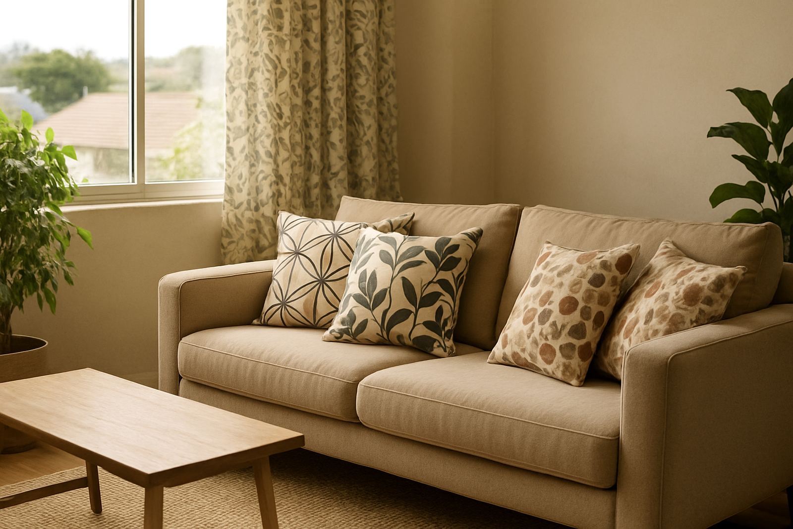
People often try to make printed fabrics match too closely and the result can look forced. It is usually easier to work within one colour family. A curtain print might carry navy, sand and soft grey, while cushions pull only two of those colours and the upholstery uses a plain cloth in one of the same tones. That gives the eye a place to rest.
- Pick one main colour and two supporting colours
- Repeat each colour at least twice in the room
- Use one neutral to calm everything down
- If the print is bold, keep the other fabrics quieter
This method works well in open plan homes from Century City to Observatory where the living area and dining area sit close together. The same palette can move through the space without every item needing the same pattern. It also makes replacement easier later because you are working with a colour system, not a single hard match.
Use scale to stop the room from looking noisy
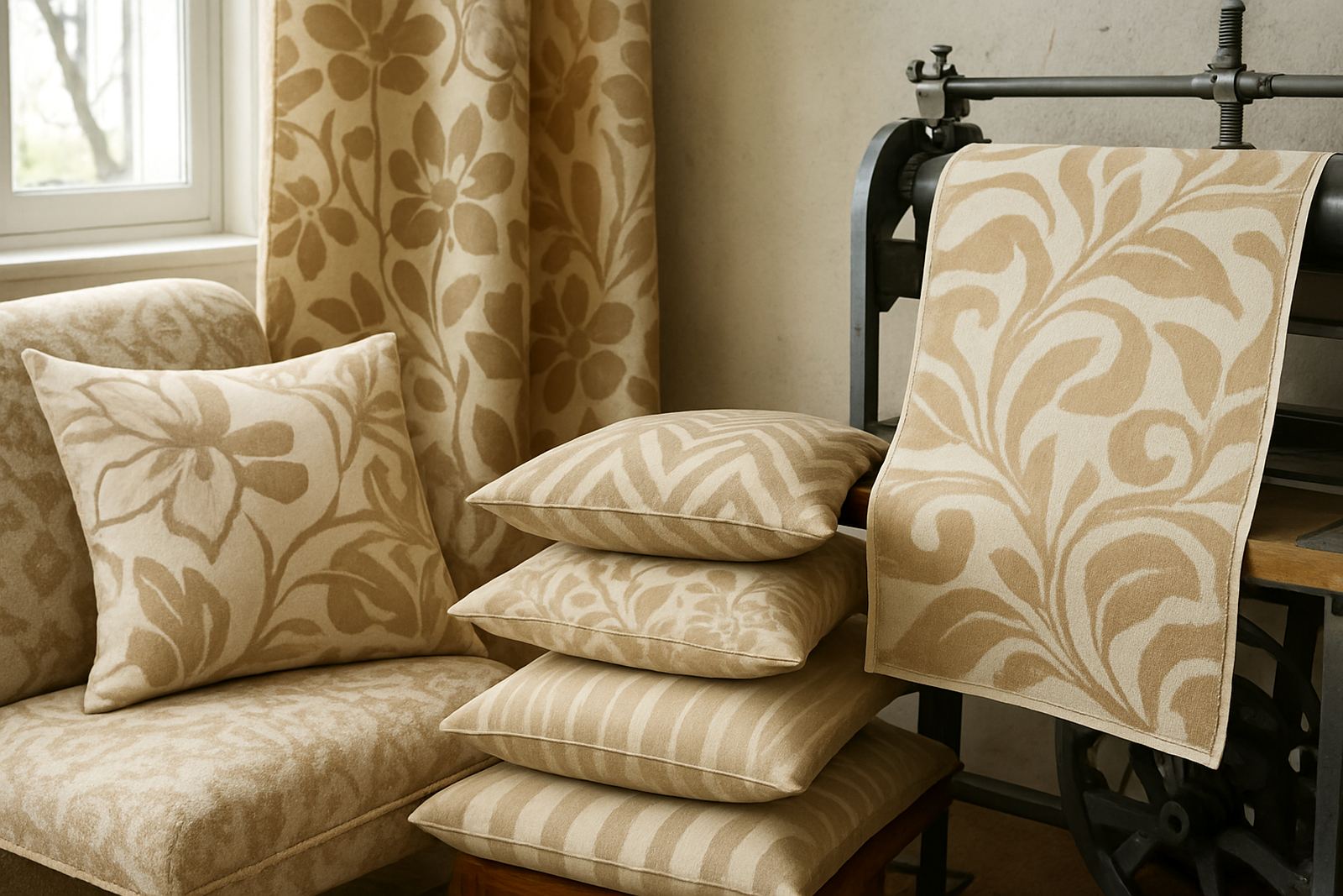
Scale matters just as much as colour. A large curtain repeat, a medium cushion motif and a smaller upholstery texture can work together, but three large patterns in one room will usually fight each other. Think in terms of visual weight. Curtains can take the biggest print because they cover the most area. Cushions can use a medium repeat. Upholstery should usually be calmer, especially on a sofa or occasional chair that is already a focal point.
If you are planning a family lounge or reception area in Salt River or Montague Gardens, measure the space before you choose the print size. High ceilings, wide windows and long sofas can carry bigger repeats. Smaller rooms with lower light need more restraint. A chair covered in a small print beside curtains with a wide repeat can look balanced if the colours stay related.
- Big print for large flat areas
- Medium print for cushions or scatters
- Fine texture or plain cloth for upholstery
- Leave some negative space so the eye can reset
Test the mix in daylight and evening light
Fabric that looks balanced in the studio can behave differently at home. Natural light changes through the day, and load-shedding means many homes also need to check how fabrics look under warm backup lighting. A pattern that feels soft in the morning may become sharper under LED lights at night. That is why strike-off sampling helps before you commit to a full run.
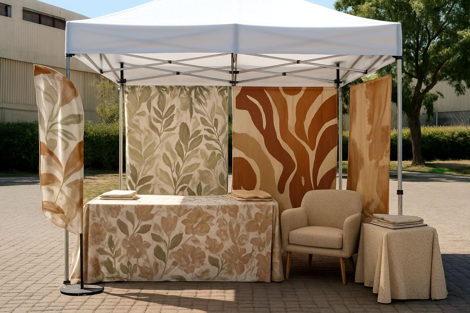
Place your sample curtain, cushion cover and upholstery swatch together near the window and again under evening light. If the fabrics still sit comfortably beside one another, you are on the right track. If one colour starts to shout, adjust the palette before placing a bulk order. This is especially useful for restaurants, guest houses and offices that need a polished look from morning to evening.
Keep practical details in the plan from the start
Good fabric coordination is not only about appearance. It also has to work for the way the item will be used. Curtains may need hemming and lining. Upholstery has to stand up to regular sitting, sliding and cleaning. Cushions should be easy to remove, refill and wash. When these points are sorted early the finished room feels more settled and lasts better.
In humid coastal homes, fabrics should be chosen with care because moisture can affect storage and finish. In busier homes near the city or in rental units, it helps to use prints that hide day to day wear. If you are planning across a full house, keep a simple record of each fabric name, colour and metre requirement so reordering later is less of a headache.
- Confirm the curtain drop and header style before printing
- Check upholstery abrasion needs for the chair or sofa
- Allow extra metres for pattern repeat and matching
- Ask for file checking before production starts
A Cape Town example: one palette, three uses
A homeowner in Woodstock may want printed curtains for a sunny lounge, two scatter cushions for the sofa and new upholstery on a reading chair. Rather than using three unrelated designs, start with one coastal inspired print in blue, sand and clay. Use the curtain fabric for the strongest statement. Then pull only the blue and sand into the cushions. For the chair, choose a plain or lightly textured fabric in the sand tone so the print gets a chance to breathe.
That approach suits flats, townhouses and family homes across Ndabeni, Salt River and nearby suburbs where rooms often do double duty. A single fabric story can move from soft furnishing to furniture without making the room feel overdone. It also makes it easier to add new items later, because the colour rules are already in place. The result is practical, tidy and easier on the eye.
When to ask for help with the full fabric plan
If you are working with several rooms, or mixing custom curtains, cushions and upholstery in one space, it helps to set the full plan before anything is printed. That means checking the repeat, confirming the colours, sampling where needed and deciding which item carries the strongest pattern. Small decisions at the start save costly remakes later.
Fabric Printers Studio in Ndabeni works with clients across Cape Town and sends fabric nationwide by courier. For home projects, retail fit-outs and business spaces, the goal is the same: print the right fabric in the right quantity, finish it properly and get it where it needs to go on time. If the room needs printed curtains, upholstery and cushions to work together, coordination matters as much as the print itself.