
Start with one calm hero colour
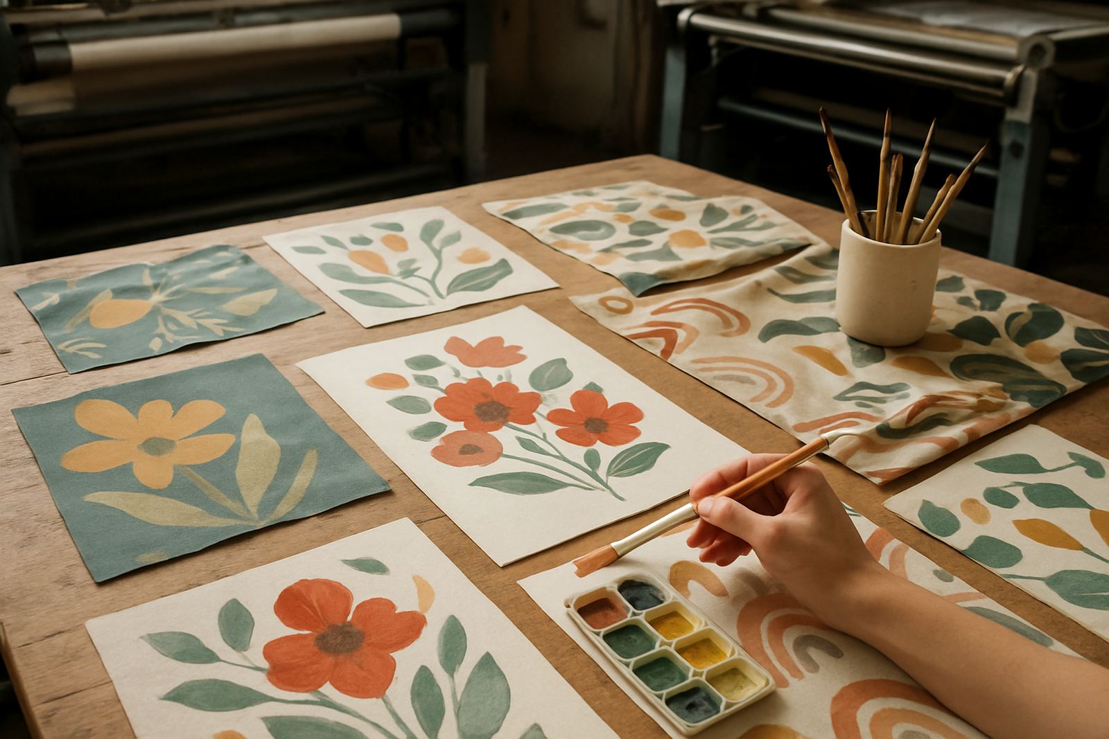
A nursery does not need every pastel under the sun. Pick one main colour and let the print do the rest. Soft sage, dusty blue, blush, warm sand and pale grey all work well on printed curtains, cot skirts and scatter cushions because they sit quietly in the room and do not fight with toys, books or wall art.
If the room gets strong light, especially in Cape Town west-facing flats or sunny houses in Century City, choose a tone that will not look harsh at midday. A muted base also helps if you want the room to grow with the child. What feels gentle for a newborn can still suit a toddler bed later, so the fabric stays useful for longer.
- Choose one main colour and one secondary accent
- Keep the base soft so the print can breathe
- Test the colour under daylight and at night
Motifs that feel gentle, not busy
Nursery prints work best when the repeat has space. Tiny stars, leaves, dots, clouds, animals and simple line drawings are all safe choices. Avoid crowding the fabric with too many details, because very busy prints can feel harsh once they are made into curtains or bedding.
For baby rooms, the best motif is often one that a child can grow into. A simple jungle leaf, small moon shapes or a soft geometric repeat can suit both a cot and a little reading corner later. If you are printing for a client in Woodstock or Salt River who wants a modern finish, keep the shapes clear and the spacing even. That gives the fabric a neater drape and makes the repeat look intentional.
- Small repeat, wide spacing, soft contrast
- Simple shapes print well on curtains and cushions
- Keep character prints subtle so the room does not feel crowded
How fabric choice changes the final look
The same artwork can look very different on cotton, polyester blends or heavier upholstery cloth. A smooth cotton base gives a softer nursery feel, while a tighter woven cloth can make the print look sharper and more practical for items that get handled often. For curtains, the weight matters because a very light cloth may let too much sun through, and a heavier cloth can help the room feel calmer in the afternoon.
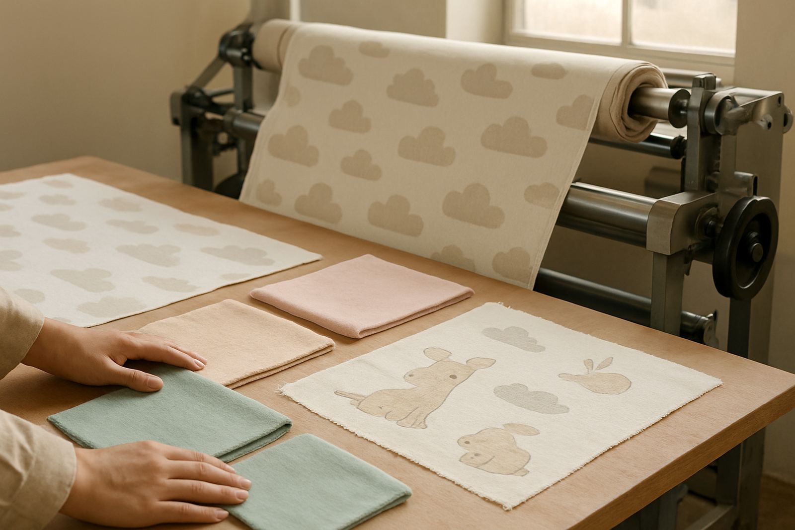
If you are making cot panels, change mats or cushion covers, ask for a sample first. A strike-off helps you check the colour, scale and repeat before you print the full order. It also shows whether the motif still looks good once the fabric is folded, stitched and washed. That step saves time and avoids disappointment, which is worth doing when you are working to a nursery opening date.
- Light cloth suits soft accessories and layers
- Heavier cloth suits curtains and seat covers
- Always check the sample in daylight before bulk printing
Practical palette ideas for real South African homes
Families do not decorate in a vacuum. Coastal humidity, summer heat and power cuts all affect what works in a nursery. In a flat near Observatory or a townhouse in Montague Gardens, a palette with cream, muted green and pale clay can feel fresh without showing every mark. In a warmer room, choose colours that look clean but not stark, because bright white can feel too sharp under strong sun.
Here are a few combinations that print well and are easy to live with:
- Sage, oat and soft charcoal for a calm modern room
- Dusty blue, white and sand for a clean coastal feel
- Blush, warm grey and cream for a gentle neutral palette
- Leaf green, mustard and pale stone for a more playful look
The trick is to keep the set balanced. If the curtains carry a pattern, the bedding can be quieter. If the bedding is printed, make the cushions plain or lightly textured. That balance keeps the nursery restful and stops the room feeling overdone.
Useful prints for curtains, cushions and accessories
Nursery fabric is often handled, washed and moved around. That means the design should work in pieces, not only as a flat image on a screen. Curtains need a repeat that does not break awkwardly at the hem. Cushion covers should hide small marks and still look tidy after washing. Storage baskets, cot drapes and pram covers need prints that stay readable at close range.
For accessories, think about how the child will use the room day to day. A plain base with a printed border can work better than a full print on every item. It gives you freedom to mix in toys, books and changing items without making the room feel cluttered.
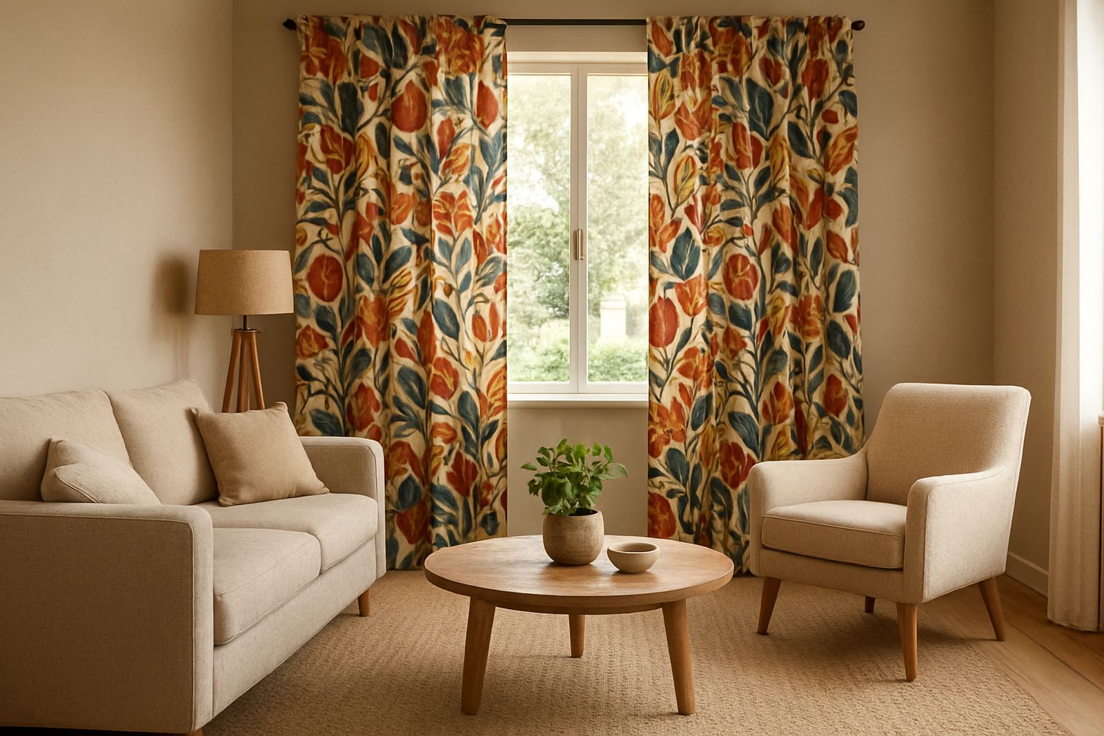
- Curtains: use larger repeat spacing for a neat fall
- Cushions: small motifs hide wear and are easy to mix
- Storage items: keep the colour darker or mid-tone for better upkeep
From sample to final print in Ndabeni
At our Ndabeni base, nursery orders usually start with file checking, colour matching and a sample strike-off. That matters when a parent or decorator wants a specific tone, because nursery colour shifts are easy to miss until the fabric is actually printed. Our team can check repeats, prepare the layout and sort hemming or finishing where needed, then pack and courier the order anywhere in South Africa.
A local example is a family in Century City who wants curtains and cot cushions for a north-facing room. A soft blue print with a small leaf repeat can cut the glare, while a sandy backing fabric keeps the room light but not bright. For a client in Cape Town city bowl, the same artwork may need a slightly warmer tone because the room gets cool light and the nursery feels more comfortable when the colours are softened a little.
The point is simple: nursery fabric should look gentle, wash well and fit the room it lives in. When the print, cloth and finish are chosen properly, the room stays practical from the first nap to the first storytime and beyond.