
From canvas or screen to cloth: start with the final use
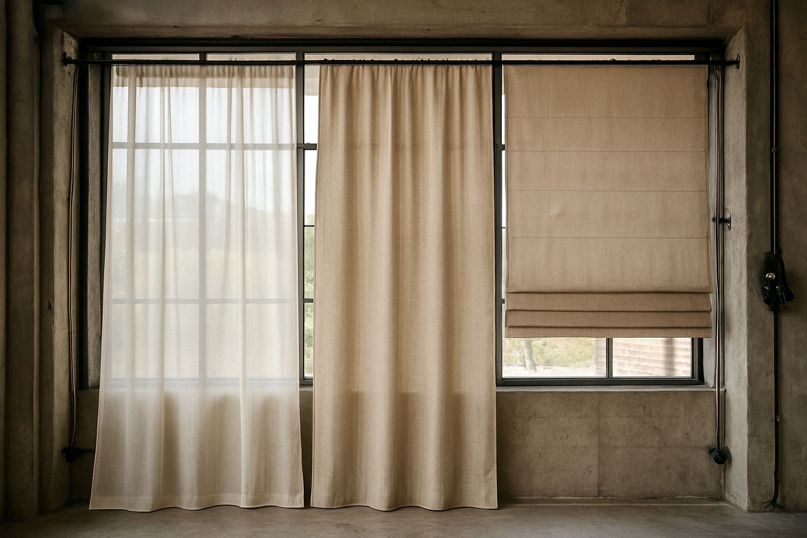
The easiest mistake artists make is treating fabric like paper. A textile has movement, stretch, drape and a surface that can shift the look of a line or colour block. Before you prep artwork, decide what the item must do. A curtain, scarf, wall hanging, cushion cover or exhibition sample all need different cloth weights and different levels of opacity.
In Ndabeni, we often see artists bring a painting or digital illustration and ask for it on the lightest fabric available. That can work for fashion, but it may not suit upholstery or lined curtains. If the artwork is bold and detailed, a tighter weave usually gives cleaner edges. If it is soft and painterly, a fabric with a bit more movement may suit it better. Think about the end result first, then build the artwork around that use.
For a local example, a Cape Town artist preparing a series for a pop-up in Woodstock might want a short run of printed panels for hangings and matching tote bags. The panel fabric can be ordered in a heavier base, while the bag print may need the design adjusted so it reads well on a smaller surface.
Prepare the artwork so the print keeps its detail
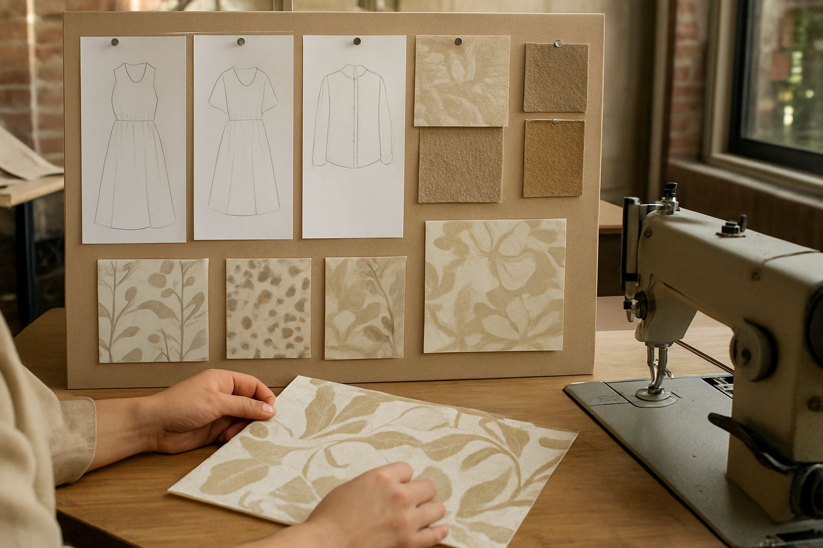
Whether the source is a hand painted image, scan or digital file, file prep matters. Texture, scale and clean edges all affect the final cloth. A low-resolution image that looks fine on a phone can break up badly once it is printed across metres of fabric.
Good artwork setup should include:
- High resolution artwork at final size where possible
- Clean background removal if the design needs it
- Repeat pattern setup when the artwork will tile
- Colour checks against the chosen fabric base
- Safe margins for cutting, hemming and seam joins
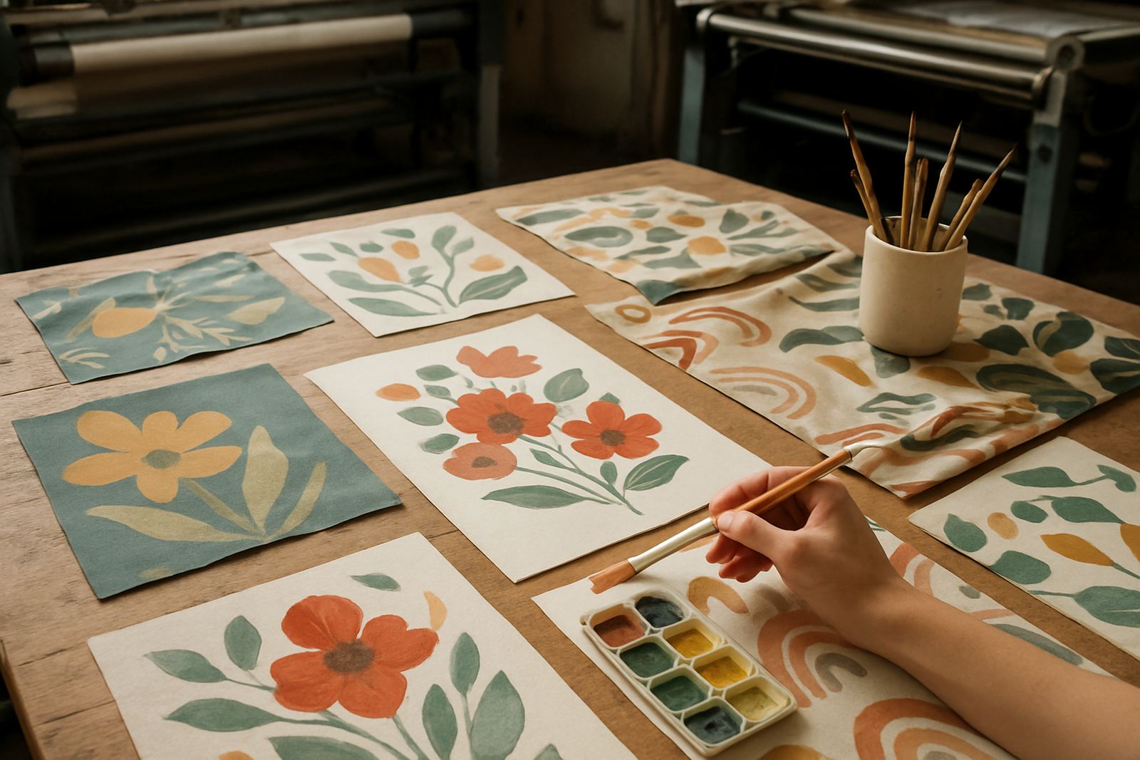
Artists working from hand painted originals should scan flat, under even light and at the highest practical resolution. Small dust marks or loose fibres can show up on the print, so file checking before printing saves time and cost. If a design is meant to repeat, the repeat must flow properly across the fabric width, not only on the screen. A repeat that looks close enough on a laptop can still show a jump in the pattern once printed across 20 metres.
Choose fabric for colour, drape and wear
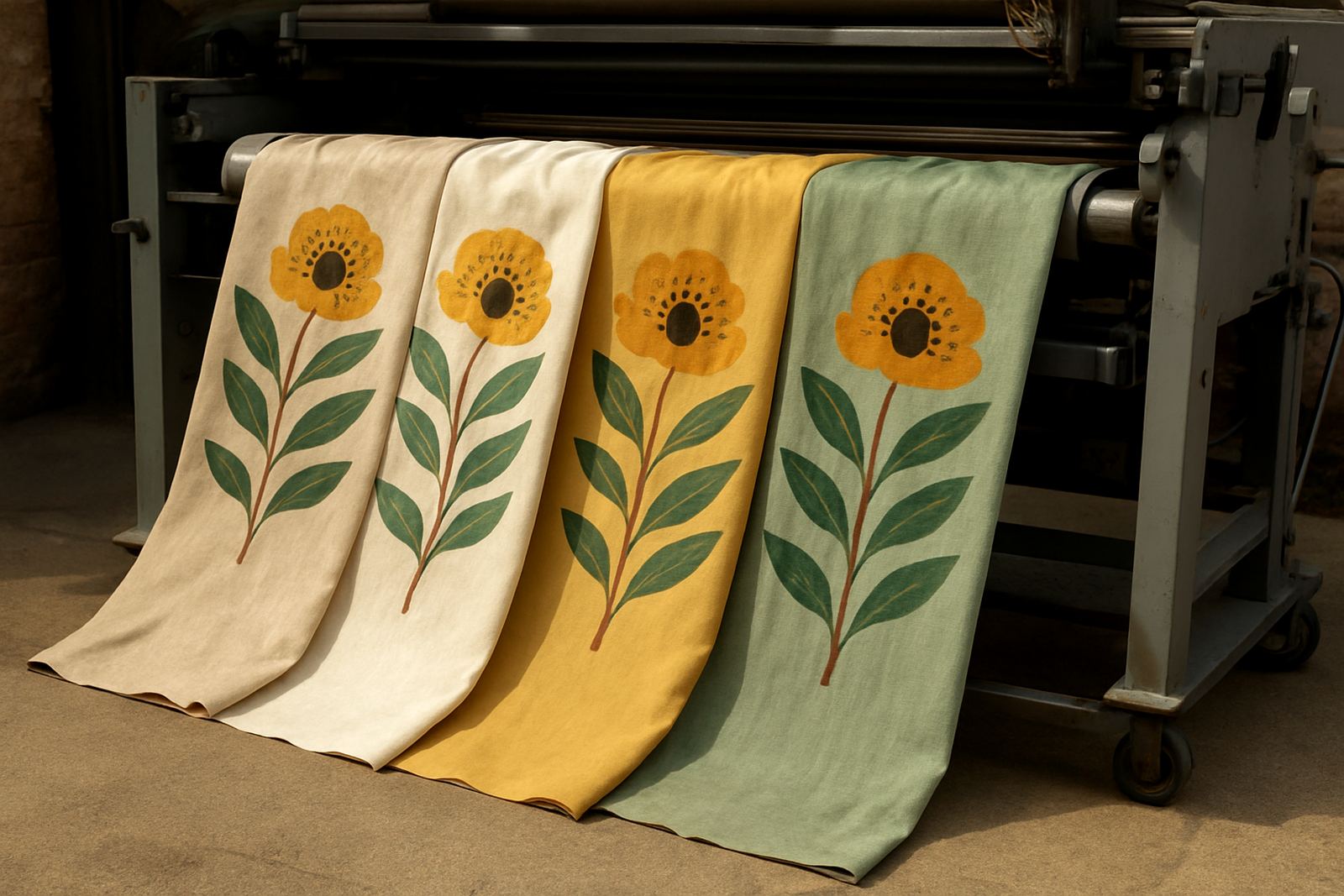
The same artwork can look completely different on cotton, poly blend or a heavier upholstery cloth. For artists, the fabric choice shapes the mood of the piece. A smooth base gives crisp detail and stronger colour. A softer or more textured base can mute the print slightly and give it a warmer finish.
For interior work, such as cushions or curtains, ask how the cloth will hang and how it will handle washing. For fashion items, check drape and skin feel. For event flags or promotional pieces, you need a base that handles wind, stitching and outdoor use. Near the coast, humidity and salty air can also affect storage, so printed fabric should be packed properly if it will not be used straight away.
Some practical questions to ask before printing are:
- Will the fabric be washed often?
- Does the artwork need a bright finish or a softer look?
- Will the item be lined, hemmed or stretched?
- Is the final use indoors, outdoors or both?
Artists doing small batch work often benefit from strike-off sampling before a full run. One sample can prevent an entire batch from being too dark, too flat or too small in scale.
Colour matching is where many textile pieces succeed or fail
Painted work and digital work behave differently once they are printed onto cloth. A red that looks rich on screen may print warmer or slightly duller. Deep blues can shift depending on the fabric base and the lighting where the piece will be used. In South Africa, where galleries, homes and retail spaces all use different light, this matters more than people think.
Colour matching is not only about getting a colour close. It is about matching the feeling of the artwork. If the original piece has muted earth tones, over-bright printing can flatten it. If the work depends on contrast, weak colour can make it feel unfinished.
Useful habits for artists include:
- Keeping the original artwork file and reference image together
- Supplying clear notes on any must-match colours
- Checking printed samples under daylight and indoor light
- Allowing for slight variation between fabric bases
For one-off pieces or short runs, colour matching should be done early. That gives time to adjust before printing the full order, especially when the work is tied to a market date, launch or installation deadline.
Finishing gives the textile a proper end use
Printed fabric is only half the job. Hemming and finishing turn an artwork into something that can be installed, sold or worn. A raw edge may be fine for a sample, but not for a curtain panel, cushion cover or retail product. The finish should suit the piece and the budget.
For artists selling directly, tidy finishing also makes the work easier to price and present. A metre of printed fabric can become a framed textile piece, a set of table runners or a limited fashion run. Each option needs a different finish, and small changes in seam allowance or edge treatment can affect how professional the final piece looks.
When planning the finish, think about:
- Whether the item will be cut, stitched or mounted
- How much shrinkage or movement the fabric may have
- Whether the print needs to align at seams
- How the item will be packed and couriered
In a busy studio, clear labels and proper packing are just as important as the print itself. A correctly marked order is less likely to be mixed up, damaged or delayed when it moves from print to dispatch.
A practical Cape Town route for artists and small brands
For artists in Cape Town, working with a local print studio keeps sampling and collection manageable. It is easier to check colour, approve a strike-off and discuss fabric choices when the studio is close by. From Ndabeni, artists in Woodstock, Salt River, Observatory, Montague Gardens and Century City can often collect or send work in with less fuss, while courier handles deliveries nationwide.
A local setup also helps when the project changes. A fashion label may need more metres after a good market weekend. An exhibition may need an extra panel because the gallery wall is larger than planned. If the printer is nearby, these changes are easier to manage without losing the flow of the project.
For artists translating work into textile products, the best results usually come from a simple process: prepare the file well, choose the right cloth, check the colour, approve a sample, then finish the fabric properly. That approach keeps the artwork intact and makes the final item something people can use, wear or hang with confidence.