
Start with the fabric base, not the screen
Colour always behaves differently on cotton, polyester, blended fabrics and coated or textured bases. A bright turquoise on a smooth, white polyester fabric may look sharper than the same artwork on a natural cotton base, where the fibres absorb more ink and soften the tone. Dark bases can also mute light colours, especially where white ink or underlay is needed.
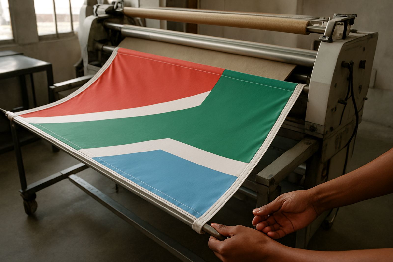
For best results, choose the fabric with the final use in mind. Curtains, upholstery, flags and garments all need different handling because the surface, weave and stretch change how the print sits. If you are unsure, send us the intended use, the room conditions or the product purpose so we can guide you on the likely colour result before production starts.
Check your artwork files before approval
Artwork quality is one of the biggest factors in colour expectation. Low resolution images, compressed files and mixed colour spaces can make a print look duller than expected. Whenever possible, work from original files and supply clear references for brand colours, past samples or existing fabric pieces.
- Send artwork in the correct size and with enough resolution for the final print.
- Use one clear reference for each colour, not three different versions.
- Tell us if the design will be repeated across metres, or placed as a single panel.
- Confirm whether the fabric is for indoor use, outdoor use, or high-wear use.
If your file has fine lines, pale greys or subtle gradients, those areas can change slightly on fabric. A small adjustment may be needed to keep the design readable and print-ready.
What sampling tells you before a bulk run
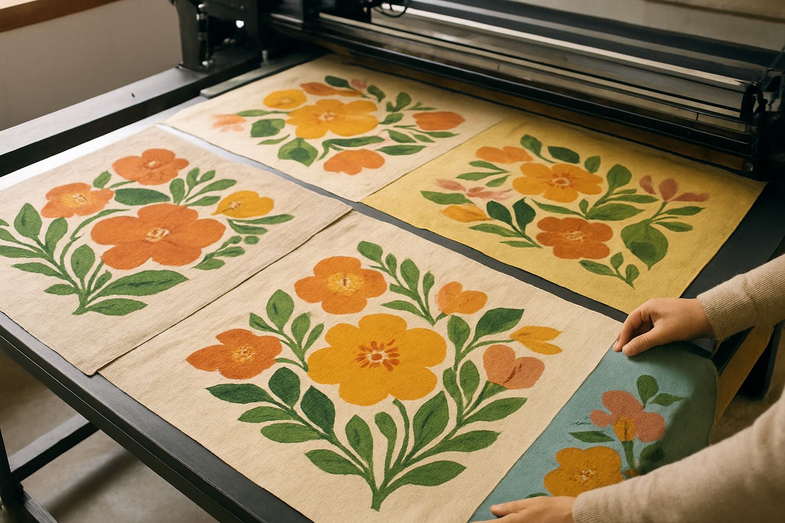
A strike-off sample is the simplest way to see how colour will print on your chosen base. It lets you check hue, density, edge sharpness and the way the fabric reacts after printing and finishing. This is especially useful for repeat orders, branded fabric, or any job where colour matching matters across multiple batches.
Sampling is worth it when you are working with corporate colours, retail ranges, event flags or upholstery where consistency is important. A sample also helps you compare the printed result under different light, including daylight, LED and low light indoor spaces.
- Check the sample in the same lighting where the final product will be used.
- Look at it dry, pressed and finished, not only straight off the printer.
- Compare it against your reference on the exact fabric base.
- Approve only once you are happy with both colour and texture.
Why finishing and fabric preparation change the result
Colour can shift after hemming, washing, heat setting or other finishing steps. Some fabrics print brighter before finishing, then settle slightly afterwards. Others need pre-treatment or extra preparation to hold detail properly. If the base is uneven, dusty or has leftover finish on it, the ink may sit differently and the colour can appear patchy.
We also check for practical issues such as fabric shrinkage, creasing and tension during printing. These are small things, but they affect the final look. For curtains and home furnishings, a little difference in tone is often acceptable. For branded work, even a small shift may need correction before the full run goes ahead.
Colour checks for bulk orders and repeat production
When you are ordering metres for a retail range or a larger project, colour consistency matters across the whole batch. We recommend keeping one approved reference sample from the first run so later orders can be checked against it. That helps when you need the same fabric again for more stock, a second room, or a fresh production cycle months later.
Bulk orders should always include a quick review of the fabric base, the approved file and the intended finish. If there is a change in supplier stock, weave or coating, the colour can shift even when the artwork stays the same. It is better to catch that early than after the full run is packed and couriered.
- Keep your approved sample in a clean sleeve away from sun and moisture.
- Note the fabric type, width and order date on the sample card.
- Ask for a recheck if you change fabric, size or finish.
- Allow time for sampling on time-sensitive jobs, especially before events.
A simple approval checklist before we print
Before production starts, use a short checklist to avoid colour confusion and save time. This is useful for clients in Ndabeni, Woodstock, Salt River, Observatory, Montague Gardens and Century City, as well as nationwide courier orders from Cape Town. It also helps during load-shedding planning, when jobs may need to be queued around power availability and dispatch timing.
- Have you chosen the exact fabric base for the final use?
- Have you supplied clear artwork files and colour references?
- Have you requested a strike-off if colour matching matters?
- Have you checked whether the design needs hemming, finishing or sourcing support?
- Have you confirmed the quantity, lead time and courier details?
Once these points are in place, the printed result is much easier to predict. If you are still comparing options, send through your brief and we can advise on the best approach for the job, whether it is a small batch or a larger production run.